So you think you know the Star wars logo?
November 2017
Dave
As an artist I have a particular affinity for the Star Wars imagery, whether that is the landscapes and scenes, the costumes and armour, or the branding and logo of the films and wider Star Wars universe.
Let’s consider the logo, picture it, the text with the letters, all capitalised, flowing into each other to create a sleek, stylised and thoroughly modern brand we all know and love, despite its 40 year birthday.
We all know what this logo looks like? It’s had an established and locked down look for the last 40 years hasn’t it? Hasn’t it?
Well, no, not really. It has evolved, as many brands do. In this opinion piece I explore how the ‘iconic’ Star Wars logo has evolved and been adapted by Lucasfilm for the purposes of the brand.
|
1976
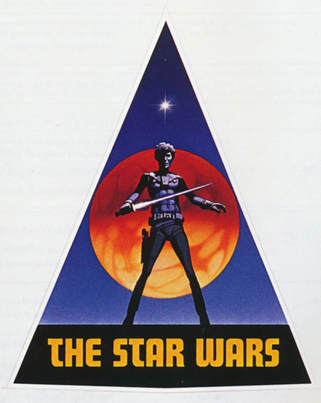
The supremely talented Ralph McQuarrie had, as with much of the known Star Wars universe, a hand in the original concepts of the Star Wars logo. The image to the left, incorporating both wording and an image set into a triangle, is the first iteration of a Star Wars logo. George Lucas wanted a visually striking image to form part of the brand and Ralph envisaged this first idea. If you look carefully you can see that the character above the text has both a lightsaber and a blaster on his hip. This is an early Han Solo character design and a number of characters were originally expected to use the energy sword later used only by the Jedi and Sith. And the name of the story itself is ‘The Star Wars’, not simply ‘Star Wars’. Even in this early iteration the text is all caps, albeit in a different font to the one we know – this being Futura Display. The image wasn’t used for very much once it was created and was quickly superseded. |
|
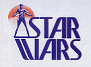
Around the same time as the previous logo there was also this one on the left, created by either John van Hamersveld (an American graphic artist and illustrator known for designing jackets for pop and psychedelic bands since the 1960s) or Joe Johnston (an American film director who worked as a concept artist and effects technician on Star Wars). From doing a bit of research there are links to both artists and references can be found online to both.
The lightsaber wielding character is still present, as is the planet as a backdrop but the wording has shifted in relation to the image, taking on a more prominent part of the overall design. The word ‘The’ has now been dropped and from this point onwards doesn’t reappear. And the logo now starts to feature the stacked shape we commonly associate with it. At this time the brand and the logo were not locked down, George and his team were playing with ideas and evolving what Star Wars was to become. There were a number of places the brand was appearing – books, magazines, comic books, promotional material and internal stationery. And for a period the 1976 and 1977 iterations were being used side by side. |
|
1977
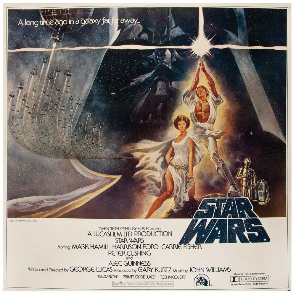
I was four when the original movie was released and I was very lucky to get to watch it at the cinema (theater for any American readers). Despite my young age, the logo on the left is one I do remember, with the text stacked and receding to a vanishing point above. This look shares much with the ‘opening crawl’ that features in the ‘Episode’ movies. As an interesting side note – the opening crawl is itself an idea originally used on the black and white Buck Rogers and Flash Gordon mini-series of the 1930s and 1940s, which were a source of inspiration for George Lucas. Dan Perri, an American film and television title sequence designer active since the 1970s, was this logo’s designer. Along with the stacked design of the logo, another aspect seen in this logo shared with later versions is the ligature joining the ‘S’ and ‘T’ in ‘Star’. Whilst it wasn’t used in the movies, it did feature on promotional material used at the time, including some of the iconic movie posters of the day and has reappeared on material over the subsequent 40 years. As such, this is the first of the recognisable versions of the logo. |
|
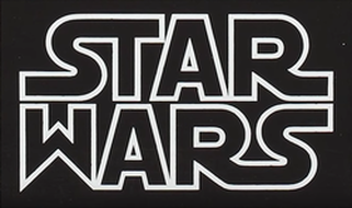
The image to the left is much closer to what we commonly see and was used initially in 1977 on 20th Century Fox material.
It was created by American, Suzy Race, hired as an art director at the time, but who is also known for screenwriting. George asked Suzy to create something ‘very fascist’ for the logo – an interesting (and controversial) choice of words. It was based upon the Helvetica Black font, a font Suzy believed was the most ‘fascist’ she could think of. George was using Nazi era German material for inspiration on the ‘Evil Empire’ in the movie, this included the uniforms of Empire officers and the name ‘Stormtrooper’ used for the foot-soldiers of the Empire and this could well have been part of his thought process with the logo. George commented that the original iteration of the logo looked like it said ‘Tar Wars’ and so Suzy incorporated ligature extensions to both of the ‘S’ and ‘R’ that exist to this day. This original logo was the most commonly used one on marketing and promotional material in the months leading up to the original movie’s release. |
|
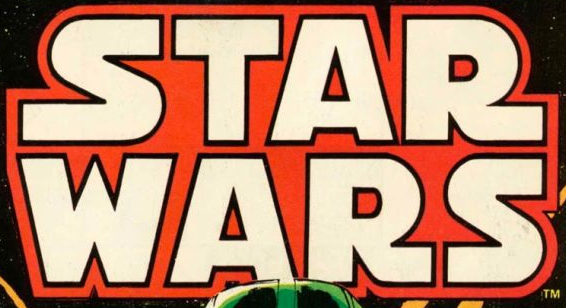
The logo to the left was one used by Marvel Comics for the first issue of their comic book series of the story, released before the movie to drive awareness.
The Suzy Race logo was presented to Marvel by the Star Wars team and Stan Lee (editor of Marvel at the time) wasn’t a fan. He felt the ‘W’ didn’t fit with the other letters and so asked Jim Novak (legendary letterer for Marvel Comics, having worked on Daredevil, Avengers, Doctor Strange, Fantastic Four, The Incredible Hulk and many others) to re-purpose the logo to fit Marvel’s style. Jim had no idea what Star Wars was at the time and so took artistic license to separate out the letters, truncating the ligatures that Suzy had added, widening the letters, with the outline also being set onto a background. This version of the logo was only used for the first issue of the comic book series, for the next issue of the comic the ligatures had returned due to trademark reasons – ‘the return of the ligatures’, or perhaps ‘the ligatures strike back’. |
|
Again in 1977, for the first time, the next version of the ‘official’ logo is a direct evolution rather than a recreation.
Joe Johnston took Suzy’s original design and re-purposed it to create the most widely known and used version of the logo as seen on the right. He widened the font to make the letters ‘fatter’, created more of a space between individual letters and aligned the angle of the ‘W’ to the ‘A’ which also resulted in a letter that looked less like an upside down ‘M’. In many ways this is very similar to Jim Novak’s design for the Marvel comic series. This redesign was in large part due to the fact that the existing Suzy design did not work well in the pan shot that was planned for the opening crawl. Since the use of this logo, initially in 1977, it has largely remained unchanged. |
|
1980 and beyond
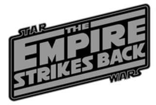
With the release of Episode V, the Star Wars elements of the logo were placed above and below the main movie title, cleverly using a key line to box the title, attaching to the words by way of their ligatures. The use of the Star Wars logo, incorporating it into the name of the film, has become the standard approach for subsequent movies, although adopting differing variations. I am sure I will be writing dedicated opinion pieces for the other movie logos in due course and mention them here in so much that they include the original ‘Star Wars’ element. |
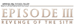
This approach was also adopted in 1999 with the release of Episode I, in 2002 for Episode II, and in 2005 for Episode III.
|
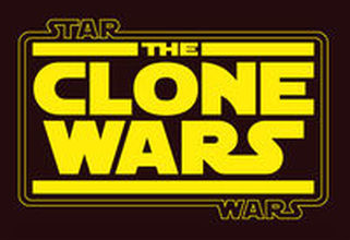
Between 2008 and 20014, Lucasfilm produced the excellent Clone Wars cartoon series.
The logo for the pilot film and subsequent TV series again featured the ‘original’ Star Wars elements. The logo regressed to a style not to dissimilar to Episode V, with the ‘Star’ and ‘Wars’ elements sitting above and below the main title, in opposite corners, connected by a key line attached to ligatures on the words. |
|
2012 and Disney
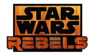
In 2012 Disney acquired Lucasfilm and announced their intention to release more products in the Star Wars universe. Rebels was first released in 2014 and was the first major refresh of the Star Wars logo and how it interacted with other elements of the programme title for thirty one (yes 31) years. The core ‘Star Wars’ components are identical to the assets originally created by Joe Johnston in 1977, but their positioning with the ‘Rebels’ part of the logo was a completely new approach. For the first time the logo stands separate from the rest of the title and the key line has been removed. This is, perhaps, a deliberate approach by Disney to show their influence whilst still retaining the familiar. |
|
Episode VII was the first of the new trilogy movies to be released in 2015, and will be followed this year (2017) with Episode VIII. Both these movies adopt the same logo layout, and following the above supposition that Disney want to demonstrate their ownership of the brand the logo again adopts a new layout whilst still retaining the original core ‘Star Wars’ elements, unchanged since 1977. Again, (as with Rebels) the key line is absent.
|
|
In 2016 Lucasfilm unveiled Rogue One: A Star Wars Story. The logo for the movie incorporates the Star Wars asset, but again demonstrates a new interaction with the main movie title, but with the inclusion again of the key line to box the main film title. With this movie logo the 'Star Wars' element has much less impact, deliberately I think as this is not a 'Saga' movie.
In 2018 we expect to see the next of the standalone movies; Solo: A Star Wars Story, and the logo once again maintains continuity of the Star Wars elements, but with another iteration of their interaction with the main movie title. This, to me, feels like a throw-back to Episode V in 1980, particularly with the angle of the logo and key line elements. |
|
30th and 40th anniversary logo
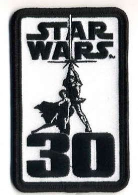
In 2007 and 2017 Lucasfilm released special editions of the Star Wars logo for use on promotional items and merchandise celebrating the anniversary of the original cinematic movie release. Both logos use the 1977 Joe Johnston Star Wars image, stacked, and incorporating a Luke and Leia image within the wider logo. Now, interestingly, the basis of the Luke and Leia image incorporated in these logos is actually a movie poster from 1977 (Tom Jung, Style ‘A’ theatrical one sheet) in which the ‘Star Wars’ logo is the 1977 Dan Perri version which was never used within any of the movies. |
The future
What next for the logo? It looks like Disney want to keep the main Star Wars aspects of the logo consistent and to use this part of the brand as the cornerstone of all future creations.
For my part I applaud this as a plan. The Star Wars logo, as developed by Joe Johnston in 1977 is, perhaps, the most iconic popular culture brand in use today, and one which is ‘very’ close to my heart.
Let us know your thoughts on all Twitter and #mtfbwy

